Johnson Beautification Committee and NVU-J BFA grad join forces
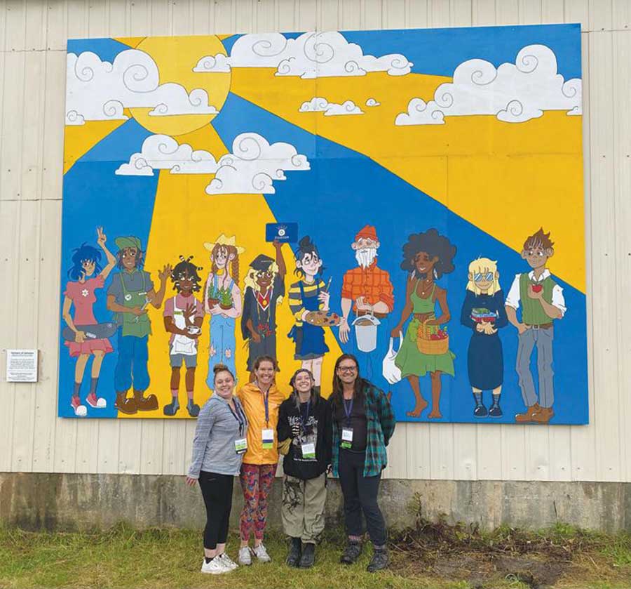
For the past month, strollers on the Lamoille Valley Rail Trail in Johnson have had an excellent view of a 12 by 16-foot mural on the side of the Town of Johnson public works garage. Painted by recent NVU-Johnson BFA graduate Finn Watsula, it is titled “Humans of Johnson,” and is a whimsical tribute to the residents of this small town in Lamoille County.
The mural is the result of a cooperative effort initiated by Johnson Beautification Committee chair Kyle Nuse. The mural was initially approved by the Town of Johnson Select Board.
“Art is sort of interpreted in the eye of the beholder,” Nuse said in a WCAX interview following official installation of the mural on Sept. 18. “We named it the ‘Humans of Johnson’ because it really is representational of diversity in different sections of our town.”
For Watsula, the mural launches what she said she hopes will be a focus of her career moving forward. “I just began breaking into the world of public art and murals, and I’m super excited about it,” she said.
Despite some initial reservations by several Village trustees concerning a perceived lack of communication between the town and village boards, the mural has been well-received. I interviewed Watsula last week, and what follows is a transcript of most of that interview.
Were there specific guidelines for creating the design? Where did you find inspiration/ideas for creating the image you did? How long was the process of coming up with the idea for the mural to then having it displayed?
I was approached by Kyle Nuse on behalf of the Johnson Beautification Committee, who commissioned me for this project. They came to me with very loose outlines, only knowing they wanted it put up on the town garage, and they wanted a design focused on the Johnson community and the recreation, nature, and businesses it has to offer. They also knew they wanted it to be suitable for all seasons.
Running with these guidelines, I drafted up a few designs and the one that ended up getting chosen by the committee was a display of several different people, all inspired by folks you may see around town. Each figure was not only inspired by the type of people you may see around but is also meant to represent different recreational opportunities or businesses we have in the area. To list a few examples, the girl to the far left holding the skateboard is a nod to the Johnson Skate Park, or we have the girl in graduation garb, representing NVU, or even the older gentleman in the flannel who represents all of the maple sugaring we have in the area. While of course every aspect of Johnson can’t be represented, I tried to get a good variety of business and recreation that reflects on the town’s culture.
Explain what community means to you (here in Johnson or elsewhere) and how you incorporated that concept into the mural design.
To me, community has always been defined by a group of people that are always open to helping others, extending kindness and support, and embracing or even celebrating diversity and differences. This can be shown in many different ways, between community projects and events to provide spaces for people to connect and work together.
While I didn’t make a conscious effort to put my own ideas of community into the design, I can see that it definitely came through anyway. All of the figures are diverse and can be seen smiling and joyful, even looking at one another in some instances. The people in it feel harmonious and connected with each other, and I suppose, in this way, my appreciation of the previously stated “extending kindness and support, and embracing or even celebrating diversities and differences” is displayed quite clearly. I also think that the different businesses being represented are an example of openness to help others and extending support.
What messages do you hope the mural conveys to the Johnson community and about the Johnson community?
The biggest message I hope to get across is one of acceptance and peaceful coexistence with not only each other but with the place we live as well. Between the people and businesses represented, I really wanted to convey the positive connections and amazing opportunities that I’ve seen presented in this town. Johnson really does have so many people supporting each other’s dreams and endeavors, and so many places where those people can come together and connect with each other. As well as businesses that help people directly achieve those goals and dreams they may have! I felt it was my goal to highlight these people and places, showing viewers that the town has a strong network of support and love for all its members.
Who else was involved with the process?
The Johnson Beautification Committee was a huge help, obviously commissioning the piece but also developing the designs with me and ultimately choosing which design was final. They also helped to present the project to the town board, as well as helped to plan the finishing ceremony. Kyle Nuse in particular, who is on the committee, is primarily who I communicated with. Without her, this mural would not have been possible, as she did almost all the behind-the-scenes work. A couple of other people who provided a ton of help are Diane Lehoullier and Don Blais, who generously let me use their home as a temporary studio space. And last but not least is the town maintenance people, who helped to hang the panels on the town garage.
Where did funding come from?
I’m not sure of the exact numbers, but I think the Beautification Committee had put aside around $1,000 for a project like this. So that was a good portion! Aside from that, the rest was raised through various fundraising and sponsorships all run by Kyle and the committee. The materials used, both the paint and the wooden panels, were all donated! Overall the project came to $2,500.
There have been some negative responses to the mural being put up, how have you responded to these comments/backlash?
The negative responses were honestly hard to respond to, as most of them were coming from a place of confusion. What is the mural about? What was it supposed to represent? The only way I could respond to these questions was simply by answering them and giving an explanation as to how the mural connects to the community. Aside from that, most of the critiques were about either the style of the mural, being too “cartoony” or about the apparent lack of diversity in the design. As for the style of the piece, I could not do much to change this as it is simply my own art style, and the only way to really get rid of the “cartoonishness” is by hiring a different artist with a different style. Fortunately, that did not happen and the cartoonish elements stayed despite some push-back. The one negative response that really bothered me though was the critiques about diversity. I tried my hardest to represent people of all genders, races, ages, etc. throughout my design, but with the limited space I could only have so many people represented. Because of this, I think some people were unable to see themselves in any of the figures depicted, which is a bummer! One of the main goals of this project was to accurately depict the Johnson community, so it makes me sad that some folks felt left out. But due to these critiques, the final product is actually much more diverse than the original sketch, including many more people of color and more variety in age. The only thing I wish I had included, looking back, is someone in a wheelchair or something of the sort, giving a nod to those with disabilities.
I am ultimately glad that this project got some pushback, as it gave me time to reflect on my design. I think because of the criticism, I was able to make changes and come out with an all-around better product.


