I’m baaaaaaaaaaaaaack! How’s it going? I hope the summer treated you well, I know it did for me
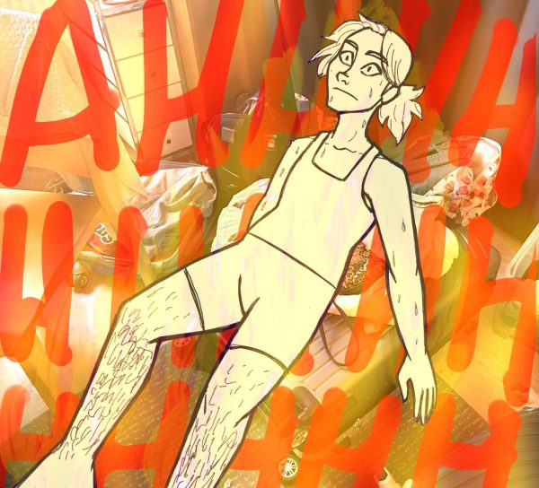
So yeah, let’s begin Part 5 of Art Tips! What to talk about, what to talk about… It’s funny because I know exactly what I am gonna be talking about for part six (save the date, issue 2 comes out on Halloween!!) But for this issue, I am a bit stumped.
So I will be talking about a very small aspect of colour theory. It’s gonna be pretty fucking rambly so if it’s all over the place, forgive me. And if there is incomplete information, don’t worry, I do plan on covering it in more detail in future issues.
So… colour theory.
The main idea of colour theory according to this helpful wikipedia article (because i am lazy af) “Color theory, or more specifically traditional color theory, is the historical body of knowledge describing the behavior of colors, namely in color mixing, color contrast effects, color harmony, color schemes and color symbolism.”
Why do they gotta spell “colour” like that..? Americans, ugh.
“wHAT THE FUCK DOES ANY OF THAT MEAN, DAD???”
SHUT–
I mean, sure, all of this sounds great and all but usually when you hear people talk about colour theory, it’s like “okay, this is what this all means, have fun” without any instruction as to what to actually do with colours. You have all these terms like cool and warm tones, colour schemes, etc. and you know what those terms mean, but you have no idea how to implement them.
Fuck around and find out.
I’m not even kidding.
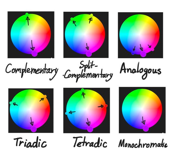
Once you know all the main colour schemes, you can play with your colours, mess around with them, and see what works best for you. Generally, there are a few colour schemes to know. The most common ones are Complementary, Analogous, Split Complementary, Triadic, Tetradic, and Monochromatic. I made this handy dandy chart that explains what these mean pretty well.
So with this in mind, you can experiment a lot. The idea is to use the colours highlighted in the schemes. So if you wanna do a complementary colour scheme, and one of the colours you choose is green, the complementary colour you use would be purple.
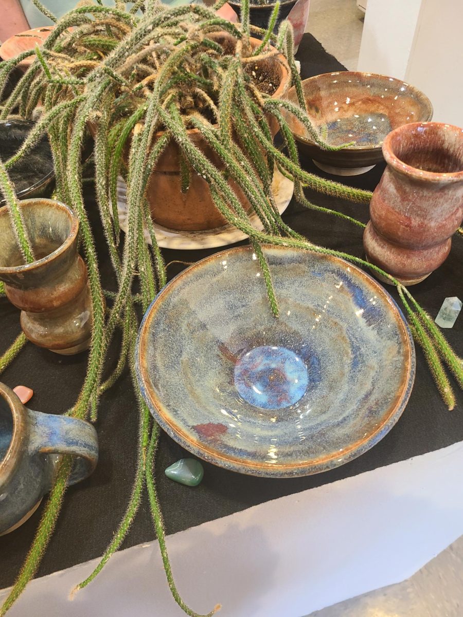
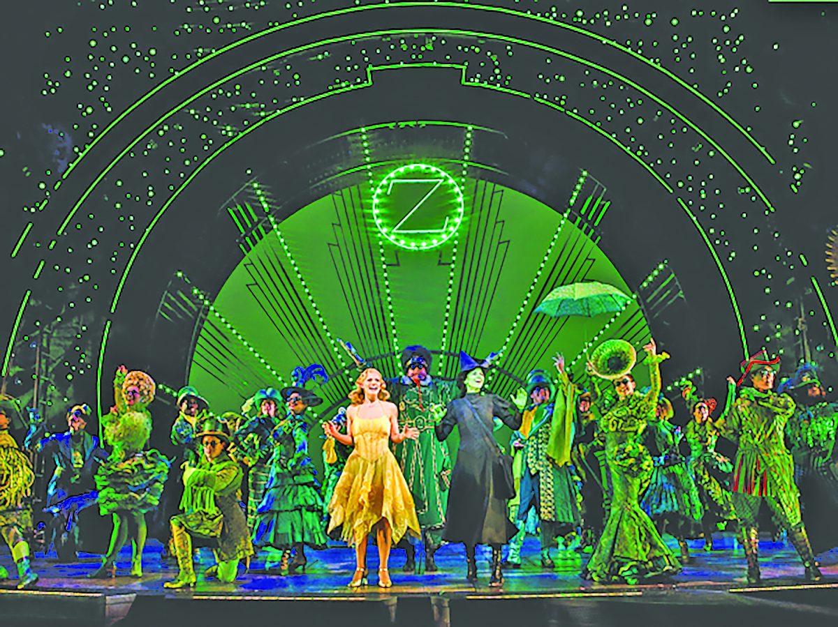
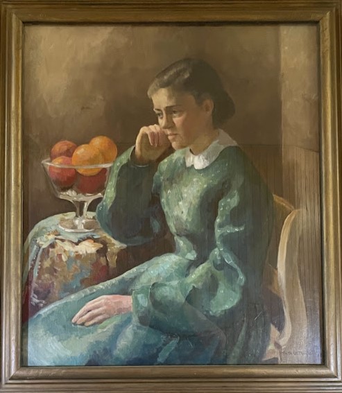
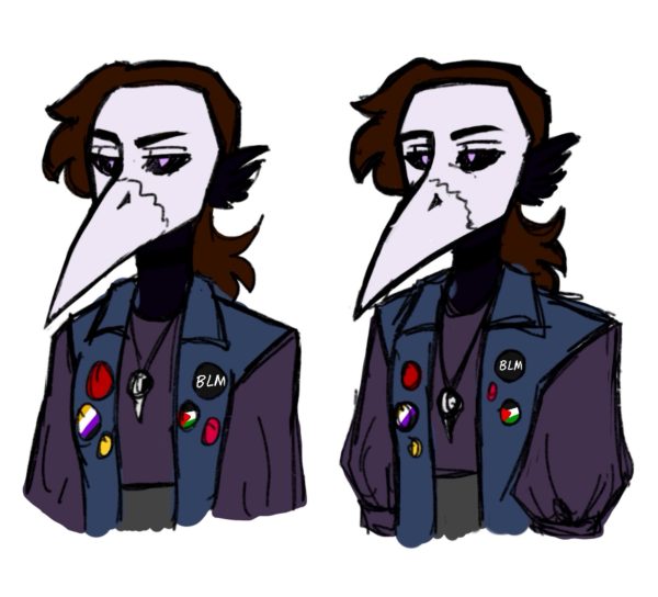
However, sometimes you will look at a piece and think “man these colours all look similar and kinda blend together…” Like… this.
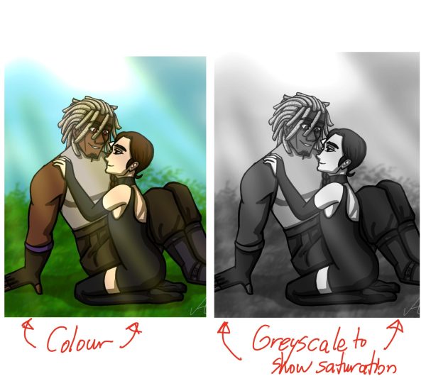
I do have one piece of advice for this! This is about colour saturation and how to manage that. When it comes to saturation in digital art, if you put a fully white layer over your other layers, then turn that layer into a Color layer, you will be able to see the image in greyscale.
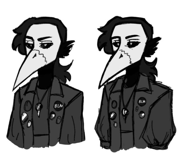
Now, what does this mean for us?
You see how you can clearly see the image’s saturation better and how foggy it looks because of it? What you can do now is Hide and Unhide the layer to mess around with the colour saturation.
“But Saaaage, what’s colour saturation?”

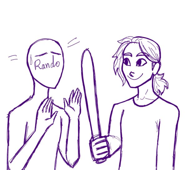
So colour saturation is how saturated the colours are–
In all seriousness, saturation dictates how bright or dull a colour looks. And you can see this on the colour… square? Yeah, colour square.
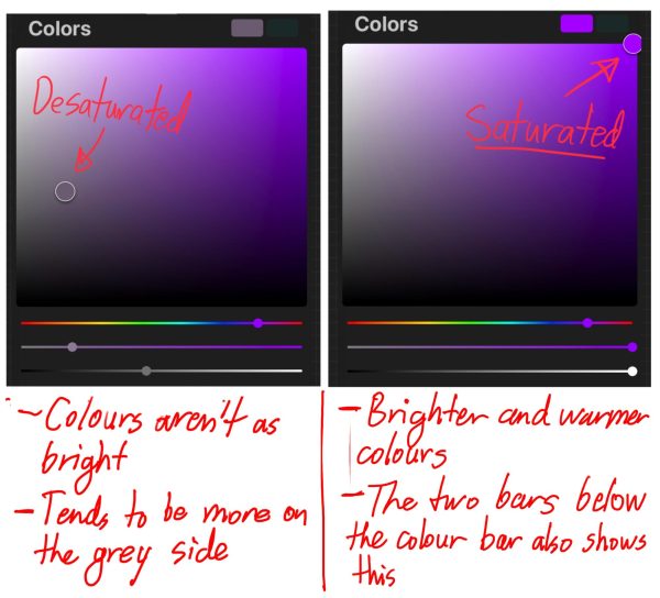
You can play with this as much or as little as you want. But for an illustration or a scene, it’s a very good idea to have a diverse saturation among your colours to prevent it from looking muddy.
Here is an example of a piece of artwork I did which has better saturation!
But with this little tip, and quite frankly, with all of my art tips, I would love to hear from you guys. Are there any art tips you guys would like to share with the world of Johnson and beyond? If you do, please do let us know at [email protected]!
So yeah… cya!


