hihihihihihi–
Bet you weren’t expecting to see a part 2 to this now amazing series! Well, guess what? You’re all idiots because I’M BACK for some more *cough* bullying *cough* art tips!
So, what shall we cover today I wonder…
I think I can safely say that we have a lot of artists on the Johnson campus and, honestly, y’all are idiots because y’all REALLY like to make things harder for yourselves. So we are going to go over some great art tips that professionals have approved of! (Cough, it’s me. I’m professionals.)
Anyway, before my editor comes in to smack me for waxing poetic, let’s get down to some art hacks/tips for your poor souls!
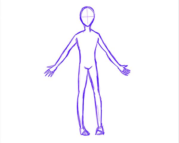
So first and foremost, let’s start with the very sexy thing known as the body. But only my body. I’m the only one who is sexy, the rest of y’all are ugly as
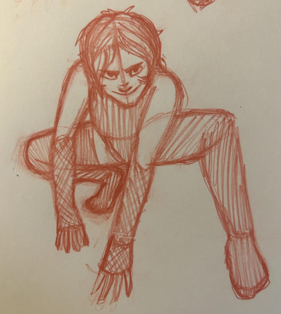
This is a body.
Let’s start with the face! The face is a mystical thing for many artists. The curves, the textures, the different ways a person can look. And depending on your style, facial features are either completely basic or have to be diverse. So, what do you focus on?
Studying proportions!
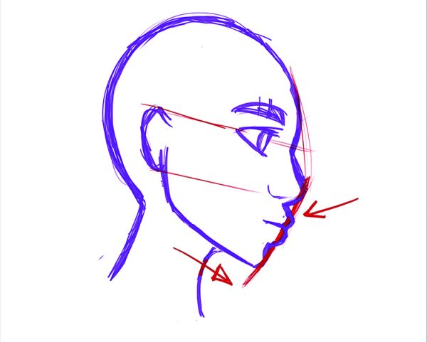
Now, this is a tricky bit because the proportions of different races and ethnic groups are, well, different! An example of commonly used proportions would be the way artists draw the chin, lips, and nose from a profile angle, like this.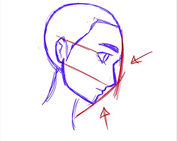
But if you look at the side profile of, say, a Black woman for example, this is different.
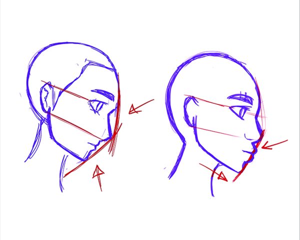
*shows another example*
Same with the front shot of a person’s face, but with the eyes and nose.
And, while this is something you are going to hear a lot from me (and honestly most artists), the best thing you can do would be to use references. If you want to learn to draw a black person, you gotta learn how the face of said person is drawn, y’know?
Ethan Becker made a fantastic Youtube video about this called “fixing black characters with the racist triangle” that is both extremely funny and also educational. And Thumin also did a similar video called “How to color DARK SKIN the right way!!” which is also a good video.
But to summerise, the idea of a hard and steadfast rule for drawing faces is not entirely accurate depending on what you want to draw.
Generally, what is commonly agreed upon is the idea that the width of the nose is generally how far apart the eyes should be from the front. But again, REFERENCES ARE IMPORTANT.
For my art style, this is how I tend to draw faces: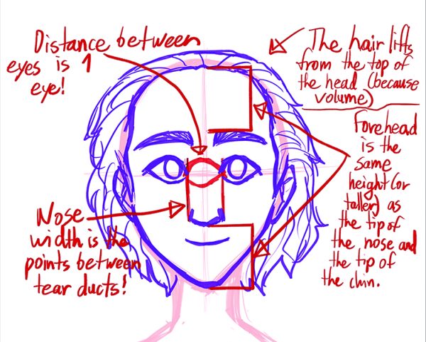
I did forget to mention that the ear height is the distance between the edges of the eyes and the end of the nose. And again, not all of these are hard and fast rules – the nose width distance can extend beyond the distance between the eyes, and the ears can even be longer, the forehead can be shorter or taller than the chin/nose distance, etc. It really depends on the person you are drawing! Also, if you have a style like mine, adding lines to the face gives the appearance of age and wrinkles.
The face is a magical thing and probably the hardest thing to draw for baby artists (besides hands), so if you are struggling, I hope this guide has been helpful to you absolute morons. Next time we’ll be covering how to draw the body because I swear if I see another goddamn fucking disproportioned body, I will screa—
The End!


